
Creating Accessible Content
The sections below describe steps you should take to ensure that your documents (e.g., Word, PowerPoint, PDF) and media (e.g., videos, images, audio files) are accessible. The steps are based on principles outlined in the Web Content Accessibility Guidelines (WCAG). These guidelines apply to electronic documents and media as well as websites.
The linked resources to the right, from the University of Washington, cover the same information as applied to specific document types.
Guidance for Specific Document Types
Make Documents Accessible
Provide a clear heading structure
What are headings?
The term "headings" refers to titles and section headings. They give web pages and documents a logical structure.
Why are they important?
Headings help individuals using screen readers and keyboard navigation move through pages and documents more easily. They also provide an outline of the content making it possible to quickly identify main points.
How do you do it?
Every page/document should have a clear title, labeled as Heading 1 (H1). Subsequent sections follow a logical nesting pattern. The first level of section headings are typically labeled as Heading 2 (H2), and subheadings within those sections as Heading 3 (H3).
Example:
Page/Document Title (H1)
Section 1 Heading (H2)
Text of first section (normal text)
Section 2 Heading (H2)
Text of second section (normal text)
Section 2 Subheading (H3)
Text for sub-section (normal text)
Use meaningful hyperlinks
What are meaningful hyperlinks?
Clear and concise descriptions of embedded links within text.
Why are they important?
Meaningful descriptions for hyperlinks, as opposed to uninformative terms such as "read more" or "see this page," help all individuals, including those who use screen readers and other adaptive technologies, understand the nature of the information that will be provided by clicking on a link.
How do you do it?
Include words that describe the page, file, or document the hyperlink goes to within a sentence. Highlight that description and insert the link.
Don't display the link as a URL. Adaptive technologies read each link character individually which can be a slow and confusing process when hyperlinks are long.
Examples
- The National Child Count of Children and Youth who are Deaf-Blind provides extensive information on the population of children identified with deafblindness in the U.S, aged birth through 21.
- For more information read the National Child Count of Children and Youth who are Deaf-Blind.
- In cases where you think users may want to print the document and therefore wouldn't have the URL, you can put it in parentheses after the descriptive link, but don't hyperlink it. National Child Count of Children and Youth who are Deaf-Blind (nationaldb.org/info-center/national-child-count/)
Provide alternative text for images
What is alternative text?
Alternative text is an invisible description for an image (e.g., photo, chart, button) that is read by assistive technology such as a screen reader.
Why is it important?
Alternative text provides important visual information conveyed by an image for individuals who cannot see it. If alternative text is not provided, a screen reader will only display the word "image" or a file name.
How do you do it?
Ask yourself the question, "Does this image convey a message or is it for decoration?"
If the image conveys a message, provide alternative text describing its message or function. Keep the description simple. If the image is purely decorative, leave the description blank. For more information see the Dallas College Page on Alt Text for Images.
Example
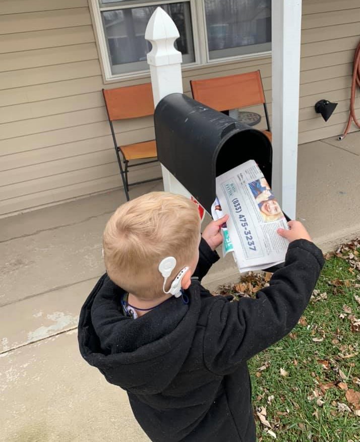
Alternative Text: Aiden retrieves mail from a mailbox.
Use color appropriately
What is using color appropriately?
There are two accessibility issues to consider related to the use of color.
- Color should not be used as the only indicator of a page or document feature (e.g., don't use color alone to show the differences between heading levels).
- There should sufficient contrast between the color of text and images and the background color of a web page or document. Here is an example of poor color contrast:
Why is it important?
Some individuals will not be able to perceive content features based on color alone or distinguish text from its background if there is not enough contrast. A screen reader, for example, will not give an indication of a change in color.
How do you do it?
Color as Indicator
Use a secondary indicator to convey the same meaning as a color to assist those who are blind or color blind. For example, it’s okay to use color in headings, but be sure to also provide a heading code (H1, H2, H3) for each level.
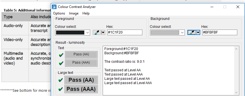
Color Contrast
Text and digital content should have a contrast ratio of at least 4.5:1 for normal-size text and 3:1 for large text (18 pt regular or 14 pt bold) in order to meet Web Content Accessibility Guidelines Level AA requirements. Use a color contrast checker to determine this.
Examples
Color as Indicator
Color Contrast
Use legible fonts
What are legible fonts?
Not all fonts are created equal. Legible fonts are sufficiently large and designed for easier reading.
Why are they important?
Individuals with poor vision, failing vision, or who have reading disabilities like dyslexia, need clear, simple text. Fonts should also be large enough to be easy to read.
How do you do it?
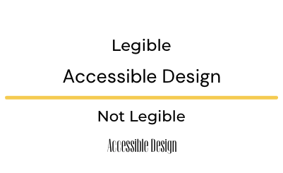
Choose standard fonts that are likely to be available on most devices. San Serif fonts are generally the easiest to read. These include Arial, Tahoma, and Verdana. Serif fonts are typically harder to read because they have more style and embellishment. Common serif fonts are Times New Roman, Georgia, and Book Antiqua.
WCAG does not have a specific guideline for font size because there are many factors to consider like font and color. However, it is recommended that 12 pt is the minimum font size for any online or printed materials.
Whenever possible, text should be real text, rather than an image of text. Text within an image, including graphs or figures, are invisible to screen readers unless alternative text is provided that includes the text.
Examples
Make tables easy to navigate
What is a navigable table?
A navigable table allows all users to access the information provided within a table.
Why is it important?
Tables are read left to right and top to bottom. A visual user will be able to scan a table for relevant information, but screen readers move through tables one word at a time. It's important to ensure that screen readers can access table information in the correct order.
How do you do it?
- Keep the table structure as simple as possible; do not use merged or split cells
- Identify row headers using table properties (see example)
- Provide alternative text using table properties (see example)
- If the information is not data, determine if there is a better way to present it (e.g., columns, lists)
Example
Creating an Accessible Table in Word (from Perkins Paths to Technology)
Make Media Accessible
Caption Videos
What are captions?
Captions are a visual representation for sound in a video.
Why are they important?
Captioning provides a text version of narration or other sounds, so that content isn't lost for those who can't hear the audio.
How do you do it?
Upload your video into a editing platform such as YouTube or Vimeo that allows you to add subtitles/captions to your videos. It's important to include all spoken information and any additional sounds that are important for understanding the content (e.g., “telephone rings”). It is also a best practice to identify a speaker with their name or other descriptor when they begin talking.
Example
Provide transcripts for video and audio files
What are transcripts?
Transcripts provide the text of narration and other sounds for videos and audio files.
Why are they important?
Individuals with vision loss or limited vision may not be able to see a video. A transcript provides a text version that can be read by assistive technology such as a screen reader. Those with hearing loss can benefit from reading captioning on the screen and/or a transcript.
How do you do it?
Create transcripts for media that is audio only. For media that has audio and video, provide a transcript and captioning. Both should include all spoken information and any additional sounds that are important for understanding the content (e.g., “telephone rings”). A description of visual actions that are important for understanding the content should be added to transcripts for media that includes video (e.g., “She answers the phone”).
Example
Provide audio descriptions for videos
What are audio descriptions?
Audio descriptions describe what is being visually displayed in a video.
Why are they important?
Individuals with vision loss or limited vision may not be able to see a video. An audio description will provide a description of key elements such as actions, movements, and the setting or scene.
How do you do it?
Audio descriptions can be included during the video development process or by adding it to a video using an audio description platform. The Described and Captioned Media Program created a Description Tip Sheet that can be used a quick reference for describing videos.